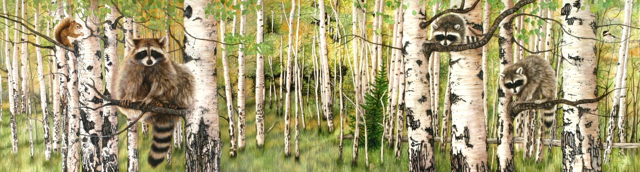
Painting a large format original painting with habitat and wildlife, on paper, canvas, or linen needs thoughtful planning for every detail.
First, begin with the idea or concept for the painting. Then the artist must collect the reference material for triggering inspired composition. A large format painting as with smaller sized painting, needs a main focal point where the eye is drawn.
The other elements in the composition, such as, the background, source of light, the season of the year, and other wildlife need to be thought out and designed right at the beginning. Art viewers will then encounter other interesting details within the painting and be compelled to linger and see more.
Working with small scale versions of the large painting will aid in the development of the final composition on the paper. One of the ways I work is with individual elements of the painting quickly drawn on Kraft paper. I then cut out these individual rough sketches.
I can move the sketches around on the small paper to see how I like the way they relate to each other. I then choose which elements I want in the final painting. I make certain to follow the basic rules of composition:
1. Divide the painting into thirds visually, with the main point of interest in the center third, either to the right or left.
2. Bring into the composition some element that draws the eye from the bottom right or left corner up through the painting, such as a stream, log or road.
3. Balance the design with the horizon in the upper third or lower third of the painting.
4. Decide which part of your painting you want to be your focal point. Then be certain that the negative space contributes to the natural “eye flow” through the painting. Do not place your main focal point in the center of the painting
5. Your light direction must be consistent throughout the whole composition. The values must be established at the beginning, showing shadows or dark areas that can be warm or cool.
6. The distant background should have more muted colors than the foreground. Your colors and values should work together to give your painting its vibrancy.
Tomorrow I’ll post Part II